my projects
meliplay - ux/ui design
context
meli play is an entertainment space within the mercado livre app itself. the initial challenge was to increase user engagement by encouraging likes and shares in a more natural way. since meli play is already integrated with the mercado livre account, it didn’t make sense to create a new profile or require a separate login. the experience needed to be seamless and fluid.
project duration
8 days
my role
designer ux/ui, research
meus projetos
meliplay - ux/ui design
contexto
este projeto foi baseado no case recebido pelo mercado livre para o aplicativo meli play, com o objetivo de melhorar a interação entre usuários dentro do app.
tempo de projeto
5 dias
minha função
designer ux/ui, pesquisa
meus projetos
meliplay - ux/ui design
contexto
este projeto foi baseado no case recebido pelo mercado livre para o aplicativo meli play, com o objetivo de melhorar a interação entre usuários dentro do app.
desafio
no último mês, a frequência de uso da plataforma caiu 4% em comparação ao trimestre anterior. Para entender o porquê, entramos em contato com nossos usuários e descobrimos que eles gostariam de acompanhar as recomendações de conteúdo de seus amigos e familiares.
1 - descoberta
segui o modelo do duplo diamante para estruturar o projeto, em seguida a matriz csd, além de um benchmark com concorrentes como netflix, prime video e disney.
3 - ideação
desenhei fluxos de navegação e wireframes de baixa fidelidade para testar a estrutura do app. focando no problema de compartilhação e interação entre os usuários.
2 - definição
organizei os principais achados e identifiquei padrões como a busca por recomendações personalizadas, conteúdos rápidos e fácil acesso a botões de compartilhação entre usuários.
4 - desenvolvimento
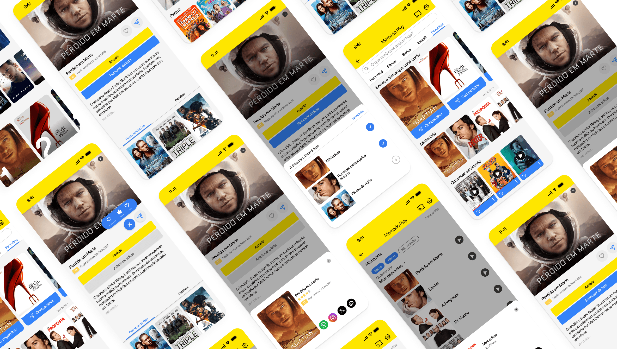
criei a interface final em alta fidelidade com foco em acessibilidade, responsividade e uma identidade visual alinhada ao ecossistema do mercado livre.
wireframe lo-fi

protótipo
quer bater um papo comigo? é só me chamar!
jemteraoka@gmail.com
linkedin.com/in/joaoteraoka/
12 99611-2929
desafio
no último mês, a frequência de uso da plataforma caiu 4% em comparação ao trimestre anterior. Para entender o porquê, entramos em contato com nossos usuários e descobrimos que eles gostariam de acompanhar as recomendações de conteúdo de seus amigos e familiares.
protótipo
1 - descoberta
segui o modelo do duplo diamante para estruturar o projeto, em seguida a matriz csd, além de um benchmark com concorrentes como netflix, prime video e disney.
3 - ideação
desenhei fluxos de navegação e wireframes de baixa fidelidade para testar a estrutura do app. focando no problema de compartilhação e interação entre os usuários.
2 - definição
organizei os principais achados e identifiquei padrões como a busca por recomendações personalizadas, conteúdos rápidos e fácil acesso a botões de compartilhação entre usuários.
4 - desenvolvimento
criei a interface final em alta fidelidade com foco em acessibilidade, responsividade e uma identidade visual alinhada ao ecossistema do mercado livre.
wireframe lo-fi
quer bater um papo comigo? é só me chamar!
jemteraoka@gmail.com
linkedin.com/in/joaoteraoka/
12 99611-2929
2025 João Guilherme Teraoka
challenge
how to allow users to interact with each other inside meli play without creating an extra registration layer? that was the main question. the idea of building a separate profile just for meli play was discarded early on, precisely to avoid compromising the natural integration with the main app. the challenge was to balance functionality with usability. it was necessary to offer new interaction points, such as liking, favoriting, and sharing.
process and decisions
i started by studying platforms that already use unified identities and gathered references for microinteractions that don’t rely on individual profiles. i created a first version of the prototype with simple actions like favoriting, sharing, and saving the list, using the identity of the user already logged into mercado livre.
during testing, users interacted naturally, without questioning the lack of a specific profile. small changes were made based on feedback, such as icon adjustments, explanatory texts, and visual feedback on actions, to make everything clearer and more accessible.
validation and results
interactions with the content increased significantly during testing, especially likes and the creation and sharing of lists. users said that navigation felt “like part of the app,” which showed that the decision not to create a new profile was the right one.
furthermore, the simplicity of the interactions encouraged more people to participate spontaneously. the biggest takeaway was realizing that, often, the best approach is not to add more layers, but to make the most of what already exists.
1 - discovery
i followed the double diamond framework to structure the project, then used the csd matrix, along with a benchmark of competitors like netflix, prime video, and disney.
3 - ideation
i sketched navigation flows and low-fidelity wireframes to test the app’s structure, focusing on the problem of sharing and interaction between users.
2 - definition
i organized the main findings and identified patterns such as the search for personalized recommendations, quick content, and easy access to sharing buttons between users.
4 - development
i created the final high-fidelity interface with a focus on accessibility, responsiveness, and a visual identity aligned with the mercado livre ecosystem.
wireframe lo-fi
protótipo
wanna chat with me? just reach out!
jemteraoka@gmail.com
linkedin.com/in/joaoteraoka/
12 99611-2929
2025 João Guilherme Teraoka