2024
A clean, responsive redesign of Steam's app enhances usability and modernizes the Store, Library, Community, and Profile while staying true to Steam’s identity.
UX/UI Redesign
Overview
Overview
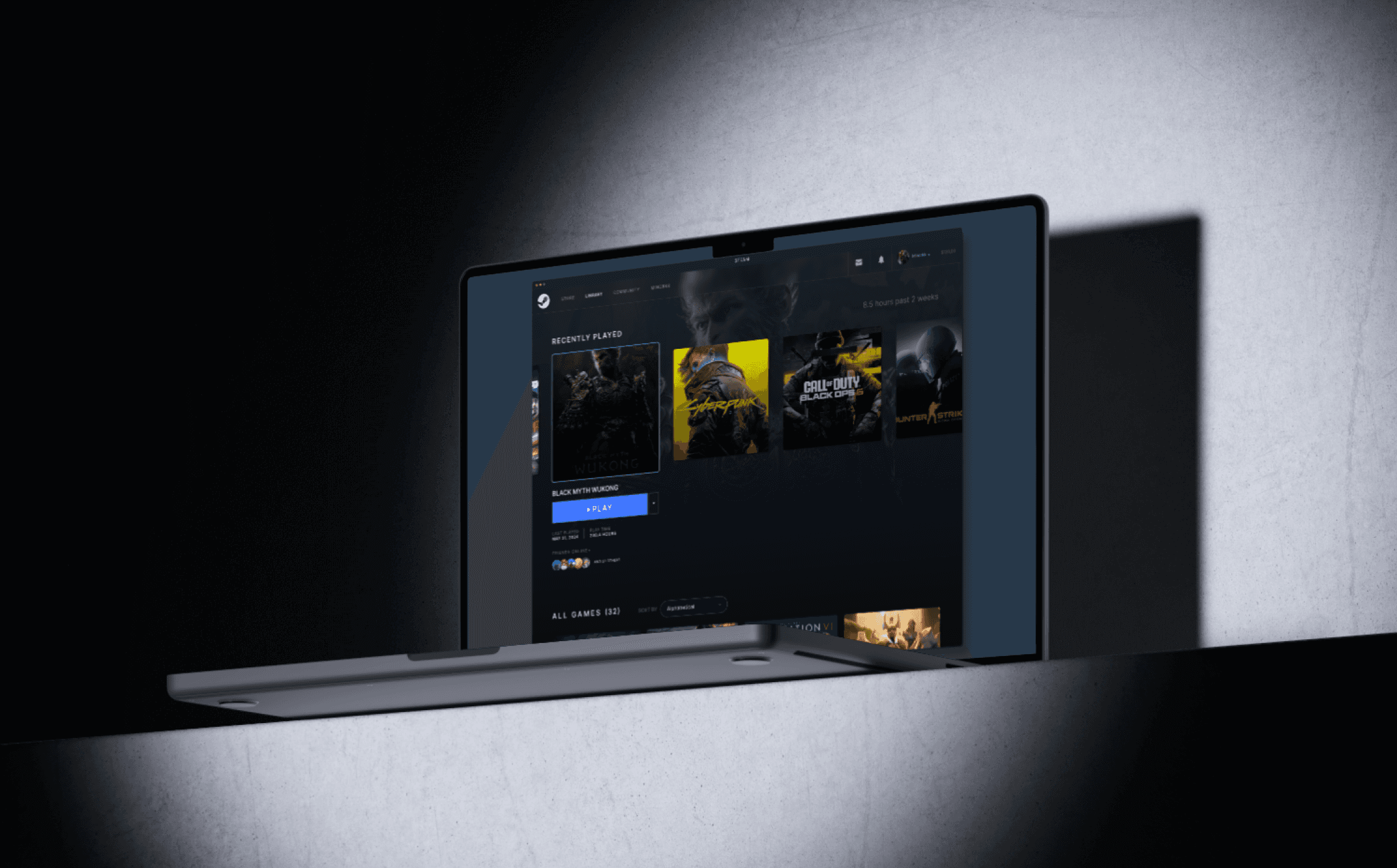
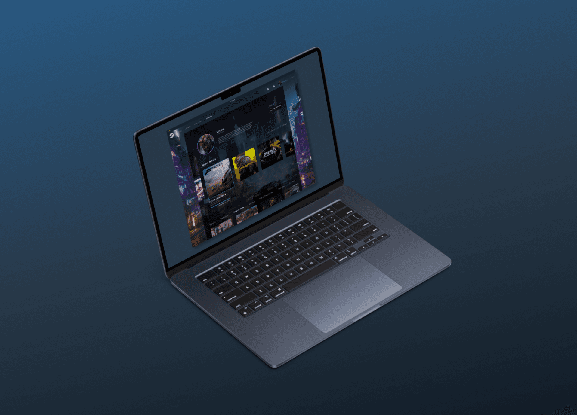
The Steam redesign project aimed to modernize a well-loved yet dated interface, with a cleaner, more minimal approach that enhances usability across key sections: Store, Library, Community, and Profile. Inspired by the fluidity and intuitive nature of PS5's interface, the updated design prioritizes responsiveness and user-centric navigation while preserving Steam's core visual identity. This redesign addresses community feedback on the need for a streamlined experience that evolves with modern UI expectations.
The Steam redesign project aimed to modernize a well-loved yet dated interface, with a cleaner, more minimal approach that enhances usability across key sections: Store, Library, Community, and Profile. Inspired by the fluidity and intuitive nature of PS5's interface, the updated design prioritizes responsiveness and user-centric navigation while preserving Steam's core visual identity. This redesign addresses community feedback on the need for a streamlined experience that evolves with modern UI expectations.
The Steam redesign project aimed to modernize a well-loved yet dated interface, with a cleaner, more minimal approach that enhances usability across key sections: Store, Library, Community, and Profile. Inspired by the fluidity and intuitive nature of PS5's interface, the updated design prioritizes responsiveness and user-centric navigation while preserving Steam's core visual identity. This redesign addresses community feedback on the need for a streamlined experience that evolves with modern UI expectations.
Store
Store
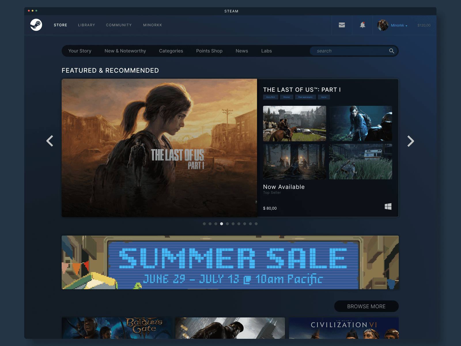
The Store page was reimagined with a lighter, less cluttered layout, emphasizing content discoverability and an improved browsing experience. Key elements such as featured game panels, promotional banners, and recommended sections were visually simplified to reduce cognitive load. By consolidating key action buttons and enhancing whitespace, this redesign brings a refined yet familiar feel, making it more engaging and accessible for users to navigate offers, new releases, and special sales events.
The Store page was reimagined with a lighter, less cluttered layout, emphasizing content discoverability and an improved browsing experience. Key elements such as featured game panels, promotional banners, and recommended sections were visually simplified to reduce cognitive load. By consolidating key action buttons and enhancing whitespace, this redesign brings a refined yet familiar feel, making it more engaging and accessible for users to navigate offers, new releases, and special sales events.
The Store page was reimagined with a lighter, less cluttered layout, emphasizing content discoverability and an improved browsing experience. Key elements such as featured game panels, promotional banners, and recommended sections were visually simplified to reduce cognitive load. By consolidating key action buttons and enhancing whitespace, this redesign brings a refined yet familiar feel, making it more engaging and accessible for users to navigate offers, new releases, and special sales events.
Library
Library
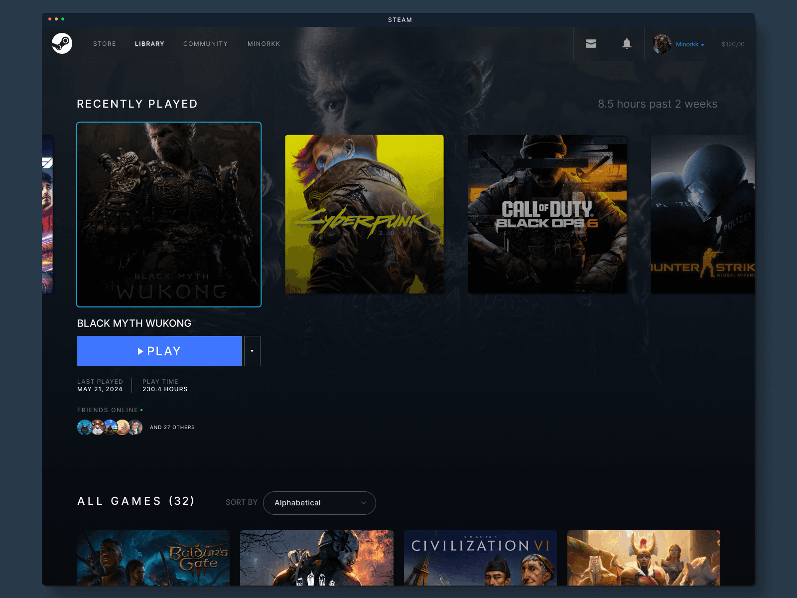
For the Library section, a primary focus was placed on content organization and ease of access. User feedback highlighted the need for better game categorization and faster access to frequently played titles. The new layout introduces a side-panel for quick filtering and improved thumbnail designs for easier recognition. Leveraging a card-based UI, the layout provides a more consistent and responsive experience across devices, making it easier to switch between viewing recent activity, game updates, and personal achievements.
For the Library section, a primary focus was placed on content organization and ease of access. User feedback highlighted the need for better game categorization and faster access to frequently played titles. The new layout introduces a side-panel for quick filtering and improved thumbnail designs for easier recognition. Leveraging a card-based UI, the layout provides a more consistent and responsive experience across devices, making it easier to switch between viewing recent activity, game updates, and personal achievements.
For the Library section, a primary focus was placed on content organization and ease of access. User feedback highlighted the need for better game categorization and faster access to frequently played titles. The new layout introduces a side-panel for quick filtering and improved thumbnail designs for easier recognition. Leveraging a card-based UI, the layout provides a more consistent and responsive experience across devices, making it easier to switch between viewing recent activity, game updates, and personal achievements.
Community
Community
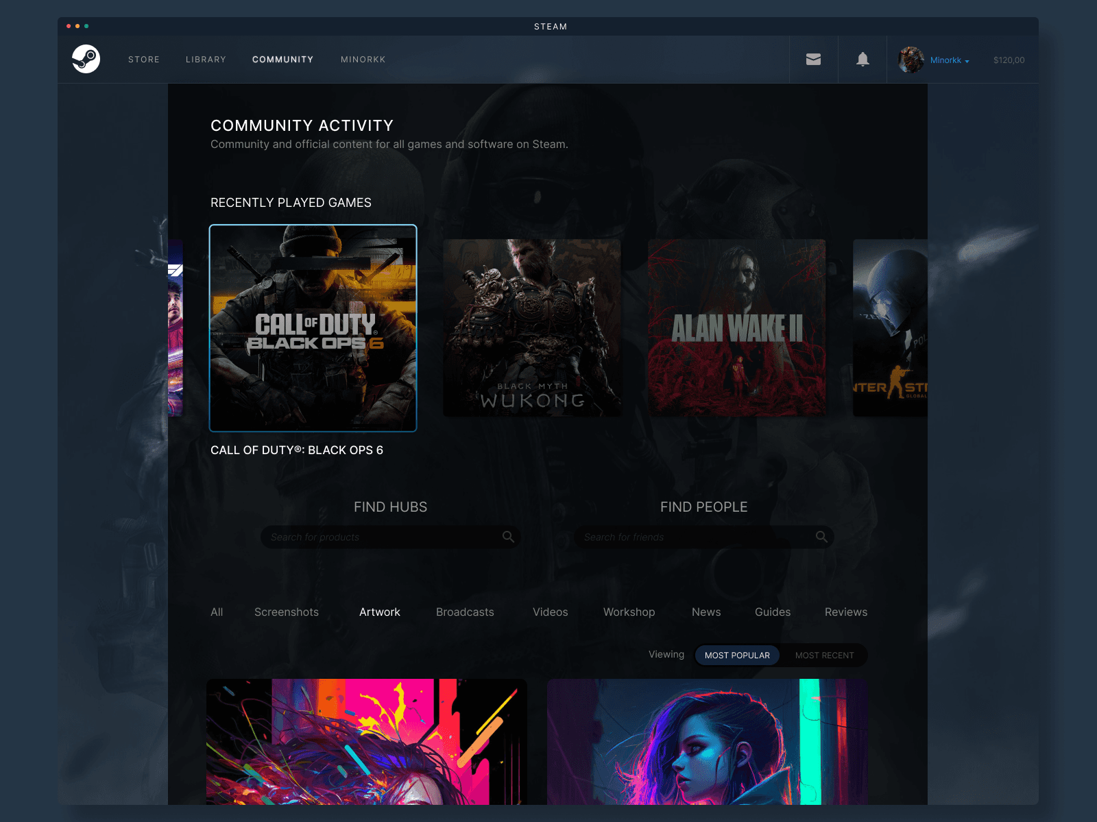
The Community section has been streamlined to create a cohesive social space where users can easily access friends’ activities, forums, and trending discussions. Community feedback often pointed to a lack of visibility for essential tools like chat, events, and group updates. The new design consolidates these elements, introducing a tab-based structure that reduces visual noise and improves navigation speed. A refreshed color palette also contributes to an overall lighter feel, making social interactions feel more organic and accessible.
The Community section has been streamlined to create a cohesive social space where users can easily access friends’ activities, forums, and trending discussions. Community feedback often pointed to a lack of visibility for essential tools like chat, events, and group updates. The new design consolidates these elements, introducing a tab-based structure that reduces visual noise and improves navigation speed. A refreshed color palette also contributes to an overall lighter feel, making social interactions feel more organic and accessible.
The Community section has been streamlined to create a cohesive social space where users can easily access friends’ activities, forums, and trending discussions. Community feedback often pointed to a lack of visibility for essential tools like chat, events, and group updates. The new design consolidates these elements, introducing a tab-based structure that reduces visual noise and improves navigation speed. A refreshed color palette also contributes to an overall lighter feel, making social interactions feel more organic and accessible.
Profile
Profile
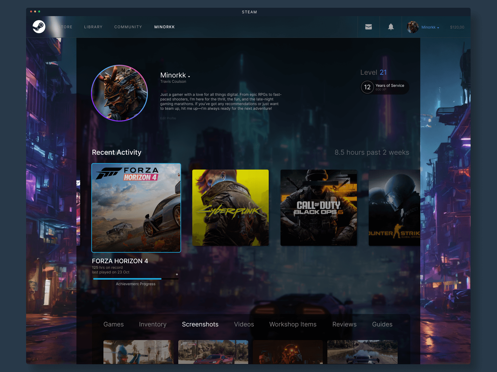
User profiles now reflect a cleaner and more personalized interface that aligns with modern UX expectations. Previously overwhelming sections, such as game achievements and badges, are now visually prioritized based on user customization, allowing for a more personal touch. Interactive elements, such as status updates and activity feeds, have been refined for an intuitive, scrollable view. The revamped layout provides greater emphasis on user identity and personal gaming stats, creating a more immersive profile experience.
User profiles now reflect a cleaner and more personalized interface that aligns with modern UX expectations. Previously overwhelming sections, such as game achievements and badges, are now visually prioritized based on user customization, allowing for a more personal touch. Interactive elements, such as status updates and activity feeds, have been refined for an intuitive, scrollable view. The revamped layout provides greater emphasis on user identity and personal gaming stats, creating a more immersive profile experience.
User profiles now reflect a cleaner and more personalized interface that aligns with modern UX expectations. Previously overwhelming sections, such as game achievements and badges, are now visually prioritized based on user customization, allowing for a more personal touch. Interactive elements, such as status updates and activity feeds, have been refined for an intuitive, scrollable view. The revamped layout provides greater emphasis on user identity and personal gaming stats, creating a more immersive profile experience.
Challenges
Challenges
This project involved balancing familiarity with innovation. A significant challenge was maintaining Steam’s brand identity while implementing a more modern, responsive UI. Addressing longstanding community requests without overhauling the core experience required careful decision-making to enhance without overwhelming the user base.
This project involved balancing familiarity with innovation. A significant challenge was maintaining Steam’s brand identity while implementing a more modern, responsive UI. Addressing longstanding community requests without overhauling the core experience required careful decision-making to enhance without overwhelming the user base.
This project involved balancing familiarity with innovation. A significant challenge was maintaining Steam’s brand identity while implementing a more modern, responsive UI. Addressing longstanding community requests without overhauling the core experience required careful decision-making to enhance without overwhelming the user base.
Final Thoughts
Final Thoughts
The Steam interface redesign respects the platform's legacy while offering users a modernized experience that is visually engaging and functionally optimized. By addressing usability pain points and enhancing visual hierarchy, the redesign aligns with contemporary design standards and anticipates future updates, ensuring longevity and adaptability in a competitive digital landscape.
The Steam interface redesign respects the platform's legacy while offering users a modernized experience that is visually engaging and functionally optimized. By addressing usability pain points and enhancing visual hierarchy, the redesign aligns with contemporary design standards and anticipates future updates, ensuring longevity and adaptability in a competitive digital landscape.
The Steam interface redesign respects the platform's legacy while offering users a modernized experience that is visually engaging and functionally optimized. By addressing usability pain points and enhancing visual hierarchy, the redesign aligns with contemporary design standards and anticipates future updates, ensuring longevity and adaptability in a competitive digital landscape.
jemteraoka@gmail.com
+55 12 996112929


